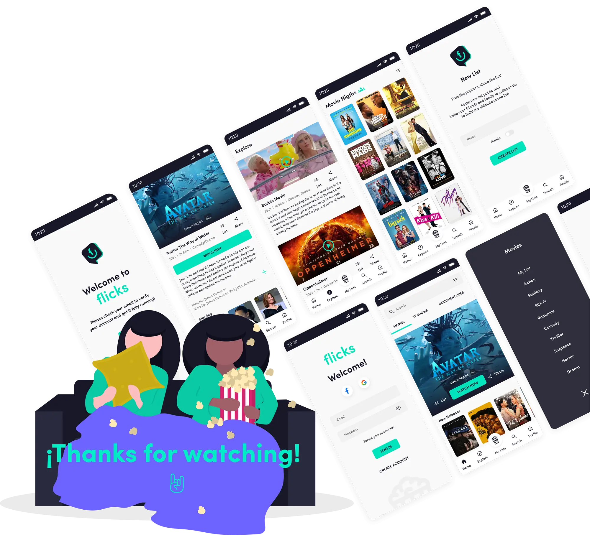
STREAMING GUIDE
Everything you want to see,
in one single place.
Year: 2021 Type: User Interface, Interaction Design, User Experience, Research.
Did you know that more than 600 million people have active accounts on at least one streaming platform, and yet they still don’t know what to watch? The content offering on each service is endless, and our lifestyle leads us to have less and less time to investigate every catalog. The services themselves have solved this by creating their own lists, allowing us to save what we want to watch. In those moments of limited time, we can turn to these lists. However, when we have more than one streaming service, things get twice as complicated.
The
Challenge
The
Solution
MVP | Main Functionalities
Integrate all
streaming services.
Universal search engine
with filters.
Infinite number of lists
(public and private).

“I like to optimize my time in all aspects of my life, so I can enjoy my free time in the best way possible.”
Frustrations:
When I feel like watching something, I can’t remember which platform it’s on.
If I’m short on time, I just want to watch something directly without spending time searching through the catalog.
I have apps to remember which series I’m watching, but it bothers me that I can’t watch them from that same place.
Core Needs:
He’s subscribed to more than 2 streaming services.
Wants to be able to recommend things to watch to friends when he sees them in the catalog.
Wants to know where each content he wants to watch is located.
Status
Married
Location
Vicente López, AR
“Spending time with my family is the engine of my life.”
Frustrations:
She is subscribed to several platforms with content for all family members, and sometimes.
She’s afraid that the kids might end up watching something they shouldn’t.
She feels like she’s not fully taking advantage of all the content offerings.
Core Needs:
She’s subscribed to more than 2 streaming services.
She wants to be able to organize family content in different lists.
She wants to continue watching a series with her husband when he’s traveling.

Benchmark

Easy to navigate.
An innovative way to display new content.
To watch something, it redirects to the app or website.
Small buttons.
The information is not organized correctly.
Does not allow redirecting to a specific episode within the series.

Easy to navigate.
The design is very clean on all screens.
Useful notifications.
Does not allow redirecting to a specific episode within the series.
The “watch” option is not easily identifiable.
Easy to navigate.
Allows marking episodes as watched automatically or manually.
The information is categorized into different tabs.
The images cover the entire space.
It does not allow “watching” content by redirecting.
Too much advertising.
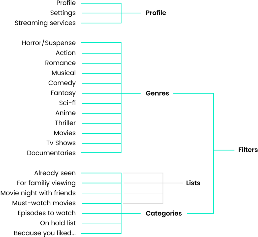
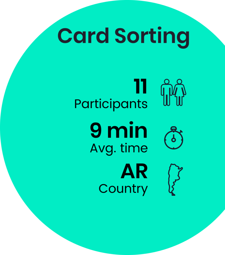
Information Architecture
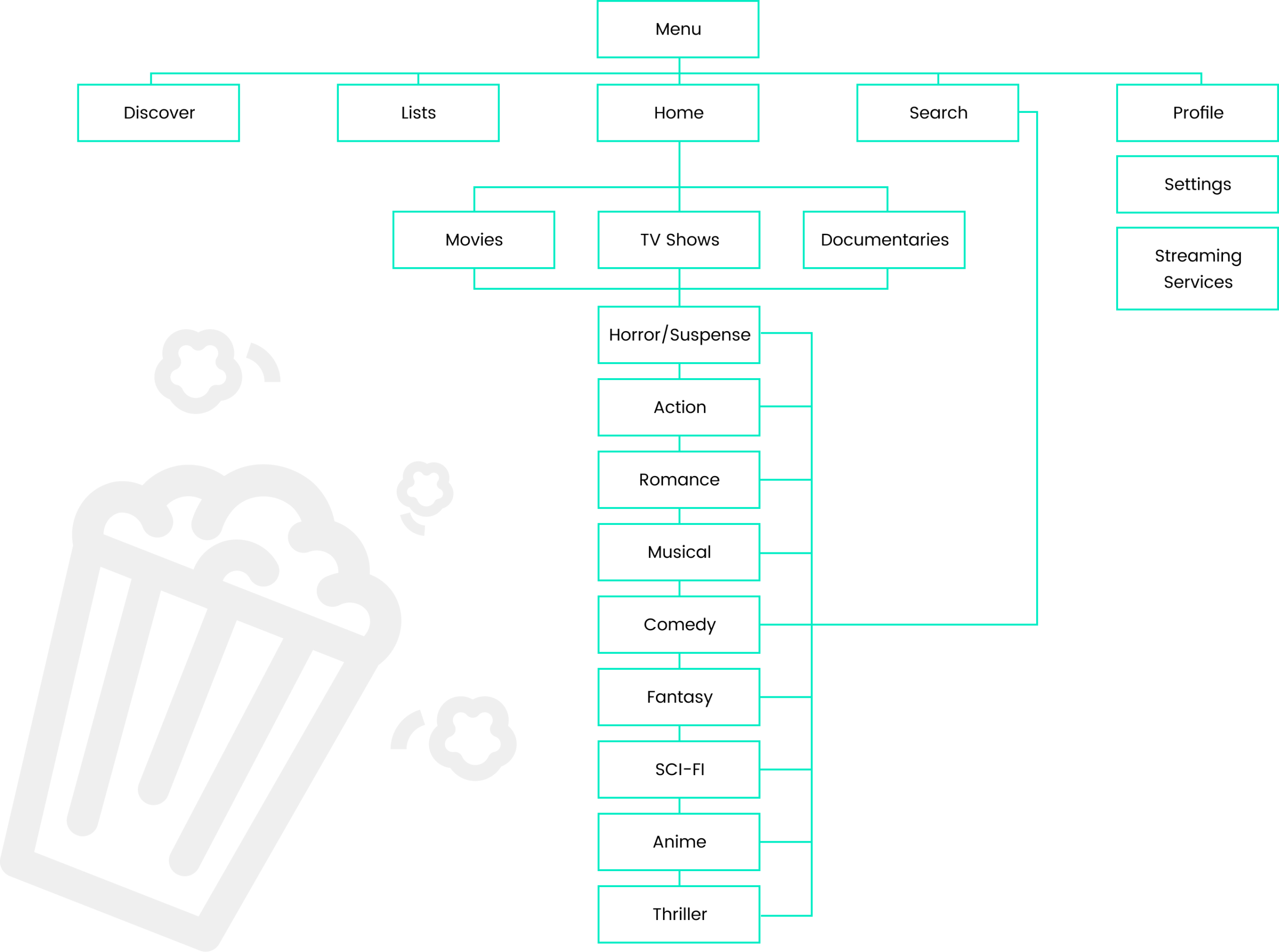
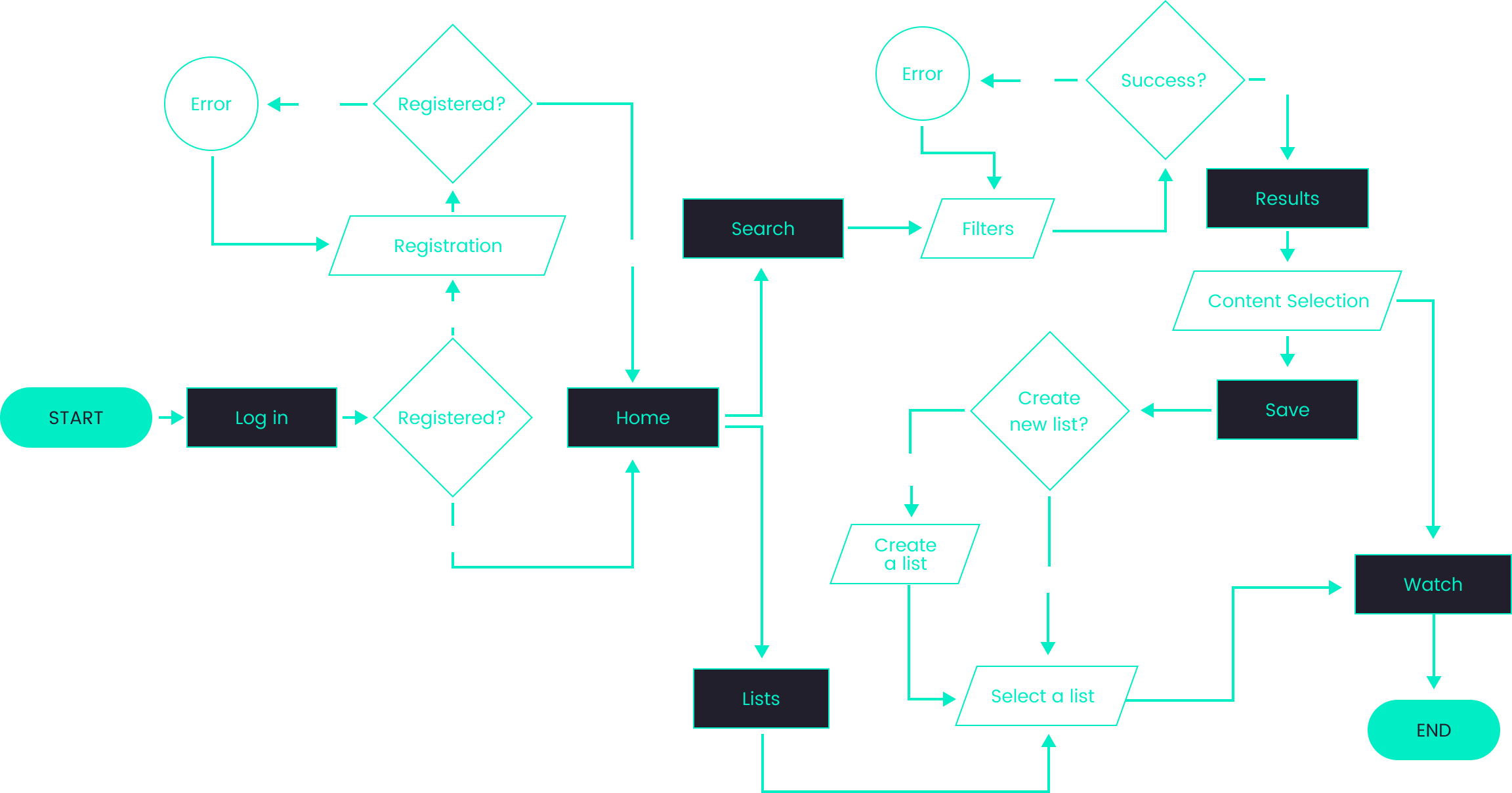
Userflow
Wireframes

Mood Board

UI Kit


